

Zella
Algorithmic music discovery concept app for Spotify users with social features.
Role:
UX Designer & Researcher
Client:
University Project
Team:
Individual
Timeline:
Oct - Nov 2020
How it started
One of Spotify’s flagship features is its music discovery playlist called “Discovery Weekly” that’s unique to each user and updates weekly. It uses data like listening history, playlists, and likes to formulate a list of songs that users should like. When Discover Weekly first launched I was excited, but after some initial use, I find myself rarely using it. This is because the algorithm Spotify uses seems to be focused on expanding the taste of the user and not just showing them music it knows they will like. On top of lacking the ability to closely match songs to users with a high success rate, it also has quite minimal social capabilities.
Problem
Spotify’s Discover Weekly is not accurate enough to reliably recommend songs its users love and lacks social features.
Solution
An algorithmic social music discovery app that pulls from a user’s Spotify data to consistently recommend great songs.

Validating the problem
To see the extent to which others face this problem, I formulated a survey and sent it out to a wide range of Spotify users in my personal network, who differed in preferred genre and age. I wanted to understand how Spotify users listen to music, talk about music, and of course, find new music. I also conducted a couple of user interviews which combined allowed me to collect a combination of qualitative and quantitative data and properly assess my initial assumptions.

How often do you listen to your Discovery Weekly playlists on Spotify?

Do you ever find yourself getting bored with your music?
Research synthesis
Knowing that research takeaways would end up framing core product features, I collected all pain points from user interviews and the survey and affinity mapped them to produce a short selection of important user struggles to include in personas and utilize as I eventually move forward into ideation.
1
Discover Weekly is not enough
Zero respondents said they listened to their Discover Weekly weekly. Most said they only used it every 2 weeks, and 1/3 of all respondents said they never use it.
2
Finding new music is hard
Only 1 out of 9 respondents indicated they didn’t have difficulty finding new music, the rest all cited moderate difficulty.
3
People like to share music
88% of respondents said they talk about music with friends and family at least several times a week.

How might we create an enjoyable music recommendation experience?
API Assessment
Before moving forward as part of my technical analysis, it was important to dive into Spotify’s API documentation to make sure the data Zella would need is accessible.

User personas
After collecting qualitative and quantitative data from the survey and user interviews I crafted two personas to help me understand and empathize with the pain points users face throughout the entire UX process.


Algorithm conceptualization
Since Spotify’s algorithm appears to be focused on expanding user taste, this needed to be focused on being as accurate as possible, only showing songs our users will love. My idea was that the best way to do this was to match users with similar tastes and then rank a list of songs not yet in a user’s playlists by frequency. This creates an impressively precise matching machine.
Working with Trade-off’s
While I would have liked to explore ideas that take different musical genres into account, I didn’t want to overcomplicate this app concept too early. It was a difficult decision to focus on a genreless system, but it allowed me to maintain momentum in the project and continue the process inside of the project timeline.

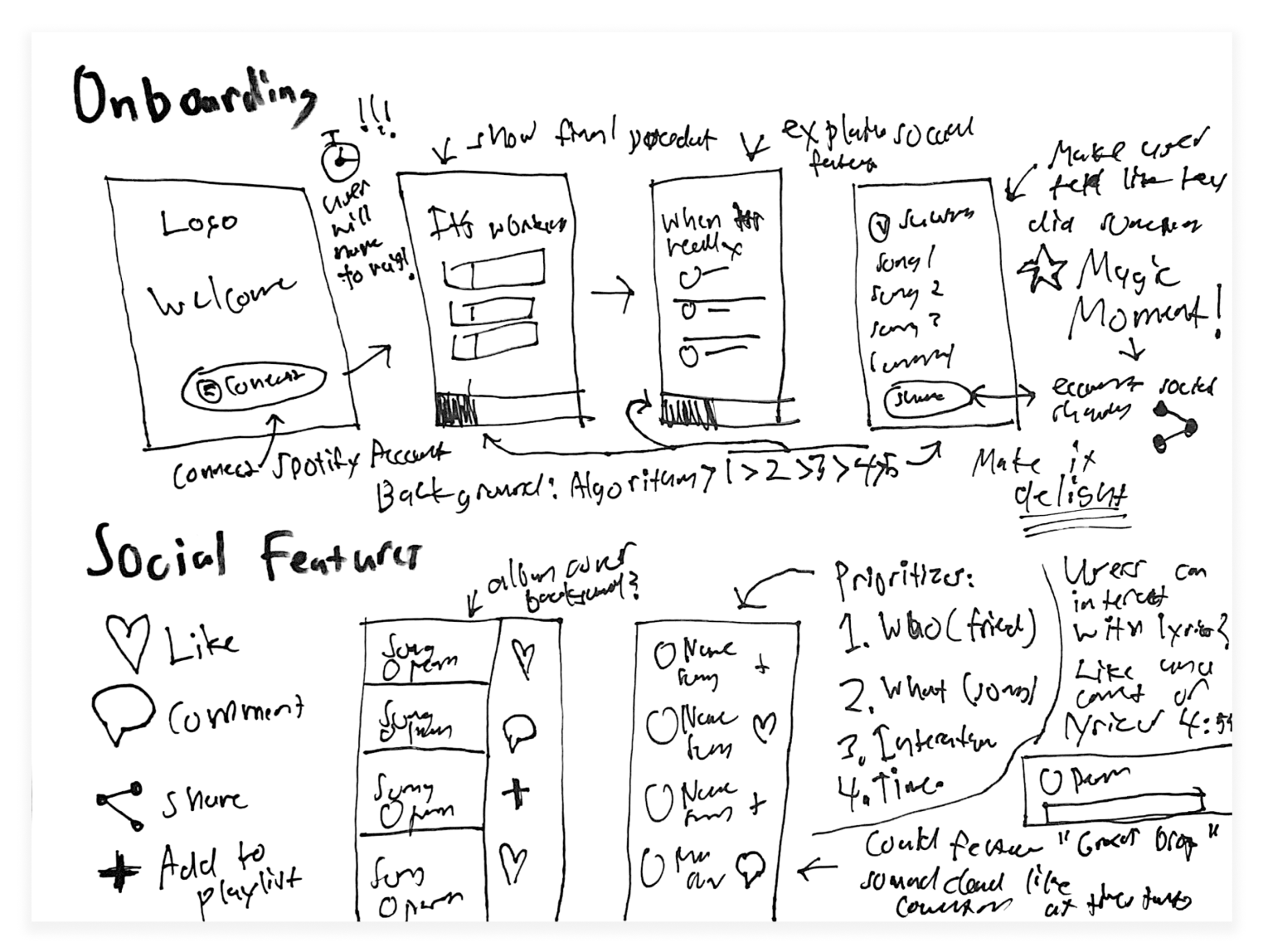
Sketches to wireframes
Keeping the goals and pain points from my user personas in mind, I drafted the first sketches of the app. I refocused on the initial problem and considered options outside of a playlist for music discovery. Carefully, I landed on the concept of displaying an almost infinite list of songs curated by the algorithm from the previous step. I imagined different ways to visualize songs, and thought of the way in which the user would interact with them and navigate through the list.
Information Architecture
Prioritizing the metadata of a song based on what users would find most relevant was a challenge, but I choose to display almost all datapoints densely within the list because I wanted to avoid situations where users would specifically avoid listening to a song out of assumptions. With a condensed display of songs, I am able to shift the focus from a particular song’s artist and title and encourage listening to the songs presented in entirety.


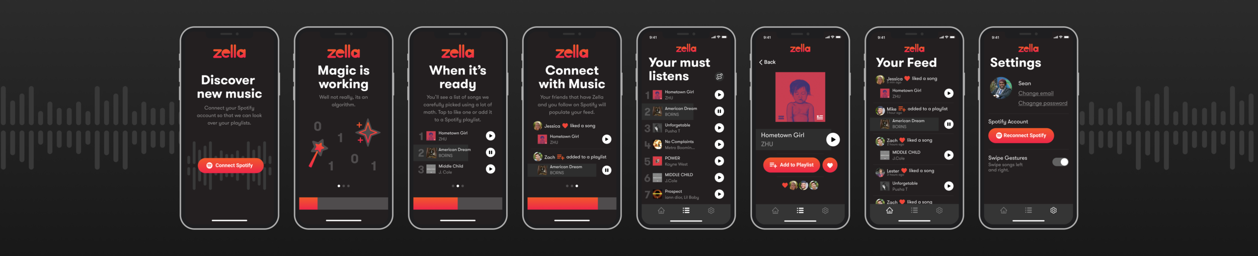
Onboarding
Since I knew pulling from the Spotify API would mean a slight wait, it was important to plan out a user experience that keeps the user engaged until they can really experience the app. This was also a good potential time for where the app could show a little bit of personality and attempt to delight users as they connect their Spotify account and await their list.

Prototyping & user testing
I crafted the first prototype of user flows in Figma using the wireframes as a framework. To prepare it for user testing, I made almost every button interactive, allowing any subject to appreciate or struggle with the flow of the app in real-time. To encourage a natural testing experience I used Figma’s Mirror app so that users to feel like they are interacting with a real app, increasing the accuracy of my results and the comfort of my subjects.

Incorrect assumptions
With data from my usability tests, it was time to go back to the drawing board and tweak aspects of the app in order to truly make an experience both easy and delightful to use. Many features and elements of the app’s interface went through several rounds of iteration until I found something that wonderfully addressed the pain point in focus.

Memorable identity
With a tested and soon to be complete app concept, it was the perfect time to define Zella’s brand clearly. I wanted to create an identity that would feel like an extension of Spotify but still, be quite unique and distinguished so users could discern that it wasn’t actually a Spotify product. Using visual elements similar to what Spotify commonly uses, but a drastically different color set allowed me to do that.
Style Guide
The logo and icons needed to appeal to both personas, being young and fresh yet elegant, professional, and timeless simultaneously. I chose the typeface GT Walsheim for the app’s headlines and copy with a similar thought process, selecting it for its approachable and friendly demeanor and surprisingly versatile ability.


Zella Final Concept
Seamless setup
The first seconds of the user experience are crucial as it’s when users solidify their first impression of the app in their memory, and their initial perception impacts retention significantly leading to potentially strong or weak business outcomes. Since users are forced to wait while Zella pulls Spotify’s API and starts running its algorithm, it’s particularly important that it’s seamless and delightful.
Magic Moment
For this app concept, the magic moment is when users get to listen to the first couple of songs and decide if they want to continue using the product or forget about it. To get to that experience quickly and retain the maximum number of users, I combined the informational onboarding with the technical setup. This means that as the user is learning about the app’s features and how to use it, in the background their list is being created and their feed populated.

The Feed
Users can see what songs their friends and family are interacting in real-time.
When a user completes an action, the app pulls from Spotify’s API to register it.
Users can play directly from the feed and also tap on songs to like them or add them to a playlist.


The List
Songs are ranked by the level of predicted enjoyability for the user.
When a user presses play, the app pulls from Spotify to provide playback.
A toggle at the top right turns autoplay on and off allowing users to make their way through the list with minimal effort.
Pulling from the list triggers a refresh and recalculation of the algorithm.

Song View
Users can view which of their friends has liked a song and like it themselves.
Settings
Here users can enable gestures and reconnect their Spotify account.


Gesture control
After learning users would be more comfortable with a separate screen for liking and adding songs to playlists, I added the ability for users to swipe and access those features quickly in order to maintain the speed of use for experienced users.
Reflection & Takeaways
This project was an incredible learning experience and a challenge for me. Being my first UX project entailing a complete process with user testing and extensive research, I found myself slightly overwhelmed at some points but was able to refocus by reconnecting with the end goal of the concept and the pain points of users I was designing for.
The biggest challenge I encountered was knowing when to dive further into a specific step, and when to keep things moving forward. At any stage in the process, one could do seemingly infinite work, testing endless variations and getting lost in potential possibilities. Being that time and resources is the main constraint of any project, it was important for me to start to learn how to prioritize different features and aspects of the idea. In order to find that balance, I kept in mind that the UX process is often continuously running and that trying to perfect something is rarely the answer. Especially since without user testing and detailed metrics, it would be impossible for me to know what really works and what doesn’t. In conclusion, I am quite happy with how Zella turned out since I think it starts to address the untapped market of social features surrounding music, and the interface built is minimal and feels distinct at the same time.
Next steps
1
Conduct more user testing
While it would be tricky to fully test the app since testing the core functionality requires development, it would still be helpful to conduct more user testing and continuously improve usability.
2
Explore expanding the feature set
The app’s social current features are fairly bare, and I would love to explore things like increased social abilities, song preview listening, and a breakdown of lists by genre or mood.
3
Ideate possible development
Executing this idea as an entrepreneurial venture would not be easy as it would face the chicken and the egg problem. I would love to think about strategies to bring it to market.
